Guide to charts (Part 1)
Guide to charts (Part 1)
A 3 part series covering common charts

Introduction
Charts are clever ways to visualize large quantities of data. They can be extremely informative if made properly. While there are beautiful and inventive ways to visualize data, we don’t typically come across them in-office meetings. They are usually meant for promotions or publications, and organizations like Gapminder. So we will ignore those and just look at the common charts that are actually shown in meetings (unless you just tables because no one cares!).
Charts are powerful because they make data visual and real. Specifically -
charts grab attention and make an impact
reduce the large volume of data into a clean visual
visually bring out the trend and relationships in the data
How to tell a good chart apart from a bad chart? Simple: Bad charts lead to confusion, good charts lead to clarity. Here’s what constitutes a good chart -
the callout (insight) from the chart is mentioned above / below the chart
It’s appropriate for the use case (details in the next section)
the color scheme is relatable to the data (preferable gradient, and never rainbow)
it has a title, legend, and axes titles – any other information needed to make sense of the chart
Here’s a sample -
How to read a chart?
Some people come across a chart and start looking at the data immediately – that’s not optimal. Do this instead –
Start with the callout, title, legend, and axes titles – You should be able to figure out what the chart is about
Look at axis values –what do they represent and what are their scales (1000s, or millions, or logarithmic, etc.)
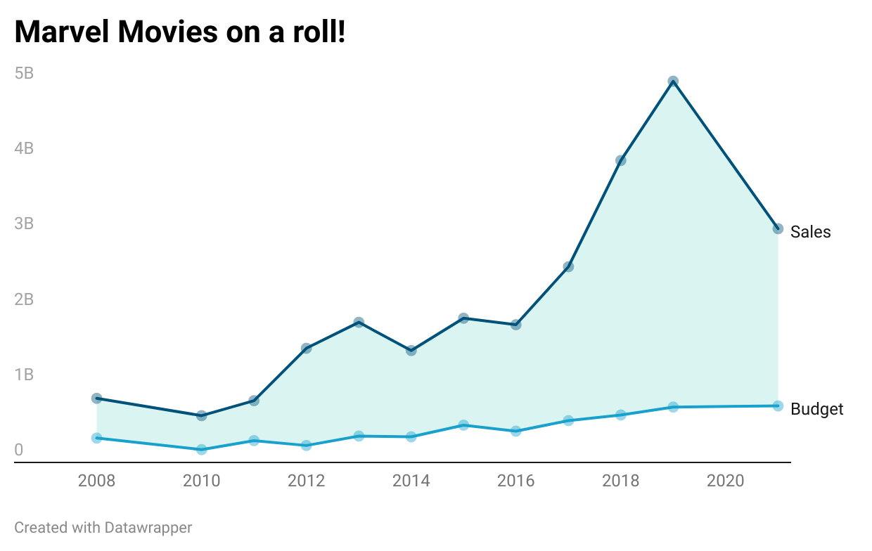
Now look at the first data point (leftmost) and interpret what it means. In the above chart, it translates to “In 2008, Marvel movies made much more in sales than their budget”
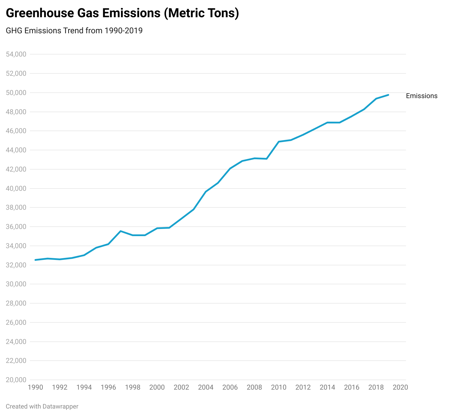
By this point, you know what the chart is about and can get into interpreting the data shown in the chart. Now, Let's get to the common charts. I have used carbon emissions data in the charts as global warming is a familiar topic.
Bar Charts
Bar charts are easy to make and can be used for a variety of purposes. So they are the most common charts in use. they are used for 3 purposes -
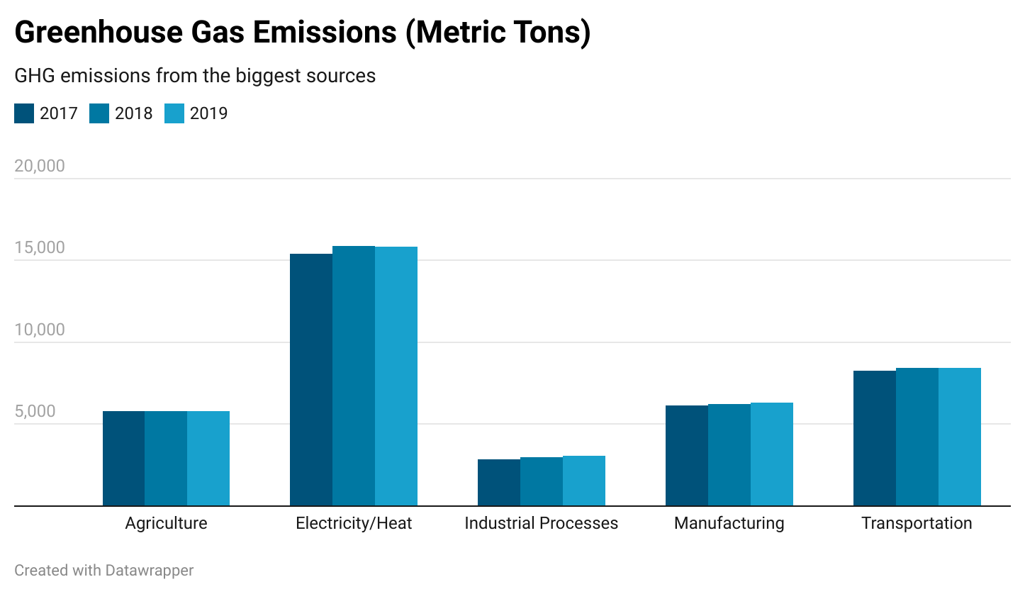
Comparison of categories: In the below chart, we can see that emissions from various sectors didn’t change a lot in 3 years.

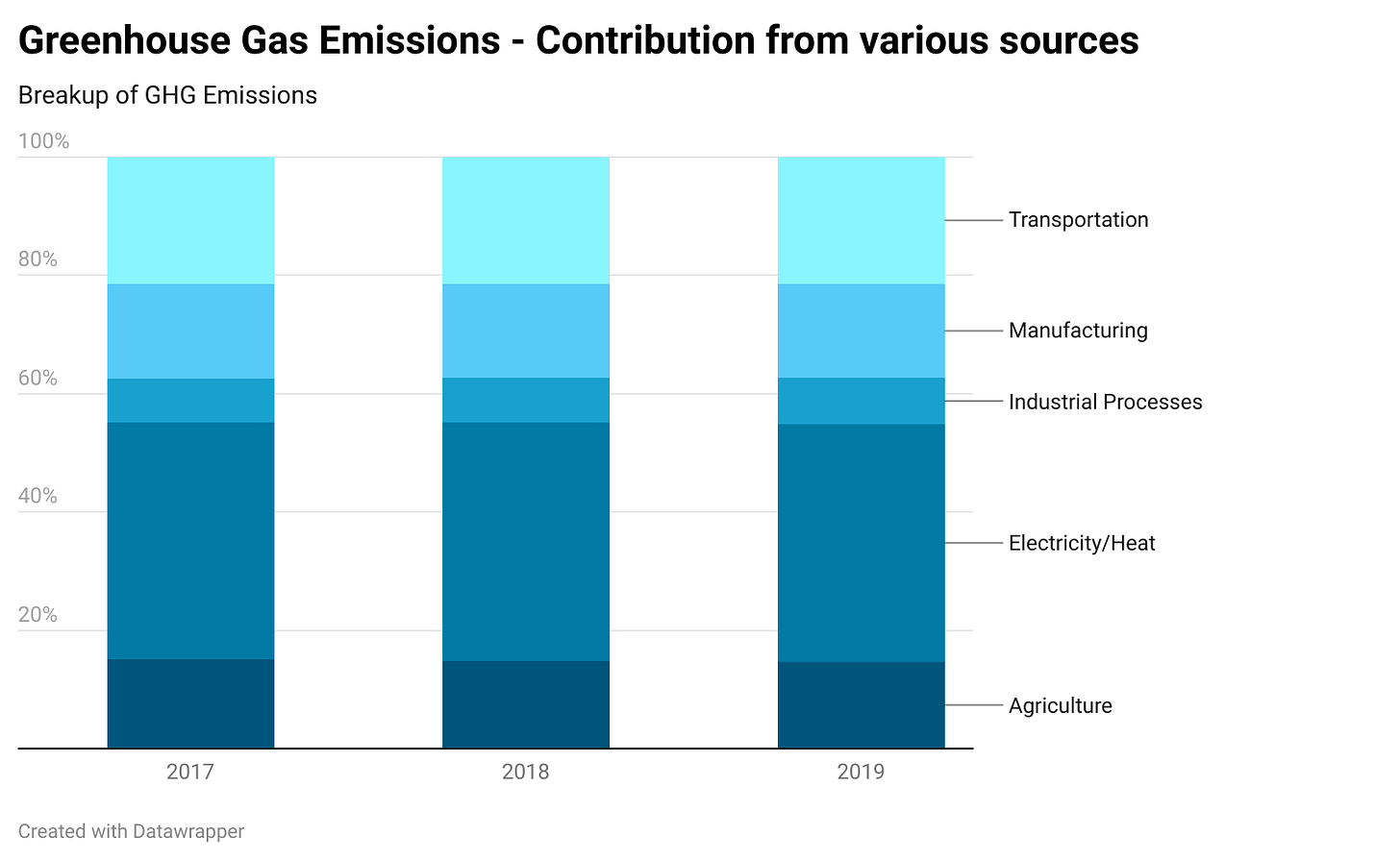
The breakup of quantity (stacked chart) - same data as above but now we can see the composition of greenhouse gases over the years.

Line Charts
Line charts are useful for showing trends over time. They can also be used to show 2 or 3 metrics and the relations between them - like the Marvel Movies chart at the top.
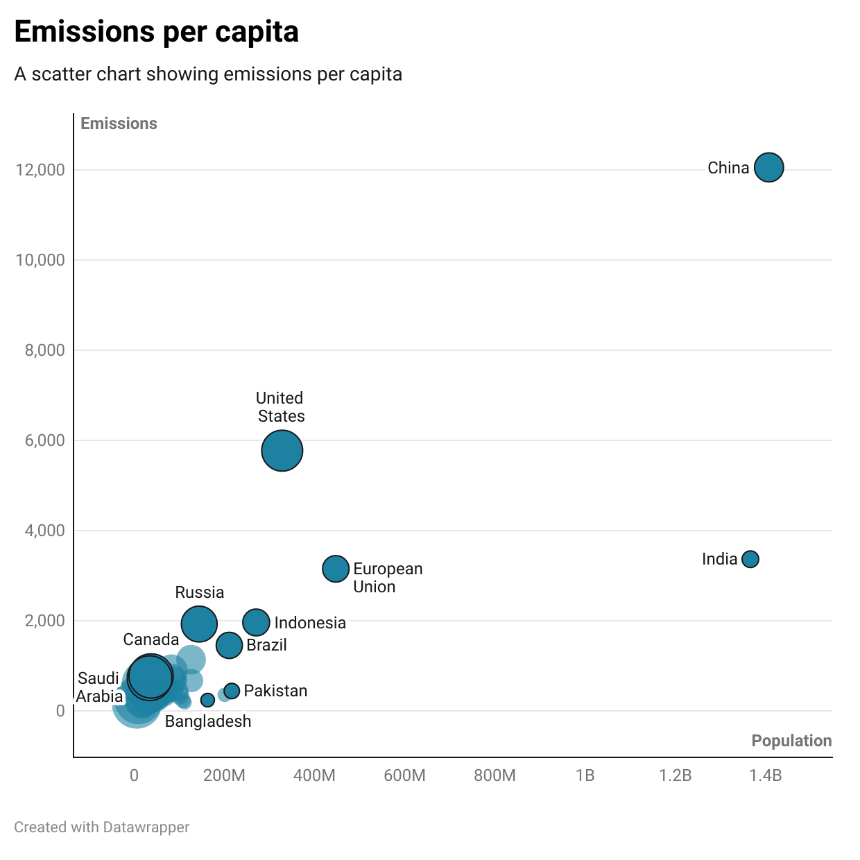
Scatter Plots
Scatter plots are not for beginners. They are used mainly to visualize raw data itself and see correlations between metrics. But they can be used to visualize an entire table as well.
Visualize raw data

to show additional information on top of raw data

Scatter plots are also used for telling jokes. You will have to wait a week for that. In the meanwhile, make sure that you pay attention to any charts you see in the coming days! Judge if they are good, read them slowly, interpret them and have fun with data!