Guide to Charts (Part 2)
Let's look at some complex charts this week

The first part discussed simple charts. Find it here. This week, I wanted to share slightly more complex charts. Don’t be deterred by ‘complex’ - these charts just break the conventions we discussed in the previous post linked above.
Let’s look at some common charts before getting into generalities -
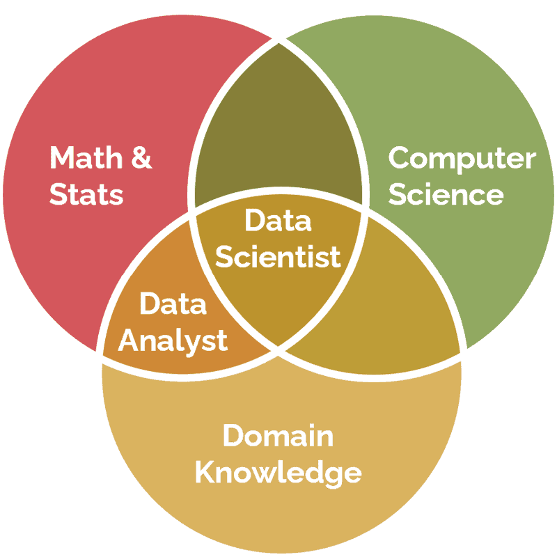
Venn diagram -

Venn diagram is a clean way of showing similarities and intersections. The space in the rectangle represents the entire population and the circles represent subgroups of the population. The areas of intersection bring out the commonness between groups. Venn diagrams are typically not used to show data, but to explain concepts like the above image. So the size of circles and the size of overlap don’t imply anything in terms of numbers.
Distribution curves -
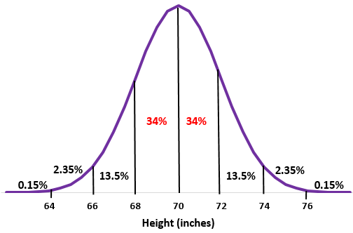
a chart showing height of 25 year old males. Taken from - statology

The above distribution is called ‘normal distribution’ and forms the basis of much of analytics itself. We will get into the details in a series of posts on core analytics concepts next month. Meanwhile, let’s see how to read such this chart.
This chart is read by calculating the area under the curve. This is true for all probability charts. The above chart shows the distribution of height. The sum of this distribution, which is the area under the chart, is always 100%. If you look at the left extreme, only 0.15% of the population has a height shorter than 64 inches. The median (middle) height is 70 inches. 50% of the population (34%+13.5%+2.35%+0.15%) has height more than this. Similarly 2.5% (2.35% + 0.15%) of the population has height more than 74 inches. More on this and its implications in the coming weeks.
If you are curious to learn about this in detail, here’s an excellent video from Khan Academy explaining it.
Heatmap -

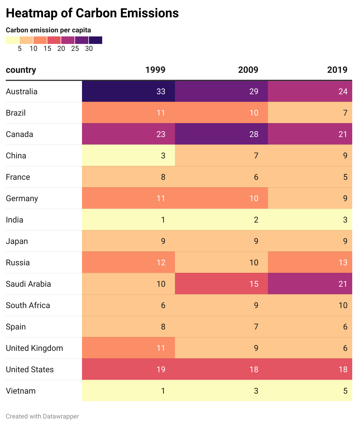
This is really just a chart with the data color-coded. I have kept the numbers here but usually, these charts hide the numbers to avoid clutter. They are useful for looking at trends over long time periods across a lot of categories.
Geographical charts (Below chart shows carbon emissions per capita)
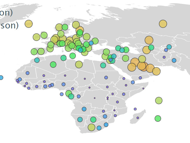
Nothing complex about these charts. you just need to know your geography. The above chart shows carbon emissions per capita in Europe and Africa. the size of the bubble represents the value of carbon emission per capita of each country.
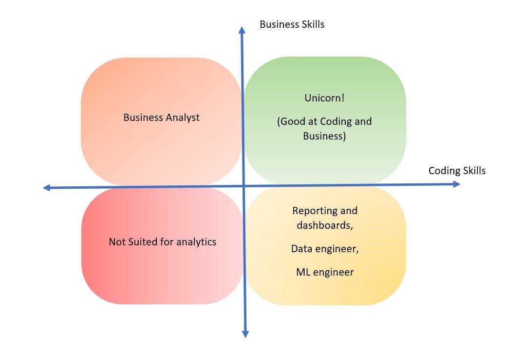
Plane charts (Not sure if they have a name)
Tree Diagram

Tree diagrams are used to show hierarchical relations. So they are perfect for company structure, family tree, and for showing clusters of users.
That’s all the charts we are going to look at this week.
There is no data involved in these charts. They show ideas by using the axis system. The 4 segments represent areas where the two axes are either high-high, high-low, low-high, or low-low. These are very powerful for getting ideas across. For example - the box highlighted red stands for candidates with low coding and low business skills. So this area is marked ‘not suited for analytics’.
The above charts account for the majority of data viz. you will come across on the internet and in reports and publications. But there are many more and new charts are always coming up. We obviously can’t look at all of them here. But we can work out an approach that works for most charts. Here is something you can do -
keep the context in mind - what is being talked about? and what does the title say? Also, what do the numbers on the chart represent?(if there is data)
Take a unit (a separate part) of the chart and try to make sense of it - what exactly is this data point?
Next place this data point in the whole of the chart - what is the relation of this unit to the entire chart. Maybe it’s a subset (Venn or any kind of distribution), or it’s a child node (in a tree diagram).
That’s all in this post. Now we are ready to wade a little deeper into analytics in the coming weeks! Till then, don’t forget to have fun with data!